-
-27%

 Vendor:Eliante by Jainsons Lights
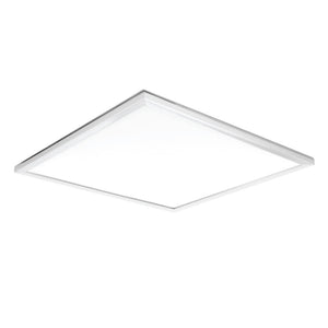
OCT-XEVA-40XM Motion Sensor 2X2 Panel Light 40w
Regular price Rs. 3,271.00Regular priceRs. 4,499.00-28%Sale price Rs. 3,271.00
A Grid panel is basically used to design complicated user interfaces where people require to place multiple elements in a tabular form of rows as well as columns layout. The Grid element in XAML signifies a Grid panel.
Buy premium quality Grid-panels Online, as it provides a flexible area that consists of rows as well as columns. In a Grid, child elements can be easily arranged in a tabular form. Besides, elements can be added to any of the specific row as well as column by utilizing the Grid.
By default, a Grid panel is mainly created with one row as well as one column. Diverse rows as well as columns can be easily created by making use of the Row Definitions as well as Column Definitions properties. The height of rows as well as the width of columns that can be defined in the following three ways:
- Fixed value: Used to assign a fixed size of logical units (1/96 inch)
- Auto: It will take only required space as it is needed for the controls in that exact row and column.
- Star (*): It will basically take the remaining space when the Auto and fixed sized are filled.
The Grid element in XAML represents a Grid panel. The following code snippet basically creates a Grid element as well as sets its background, width, height, vertical and also horizontal alignment properties.


